Saluation again our darling foundlings ~ how hive you bee-n?
Fun fact of the week: bees have four wings, no wonder they’re such nosiey insects!
From our previous posts, you should now all have a running theme and idea on what your product and/or service should revolve around.
Let’s use our Holden Honey Hives as the case study today to provide you with working example to review.
Now, a cover needs to be engaging, eye-catching, and most importantly, relevant.
It may take hours, days, months, potentially even years. Or it might take minutes, seconds, moments. You might get it right first attempt, you may not. These things take time and shouldn’t be rushed, unless the Queen Bee orders it. When it happens, you’ll know. You’ll think “that’s the one”.
Creating a cover involves miniscule changes using Adobe programmes such as Photoshop and Indesign, as shown in this working example.
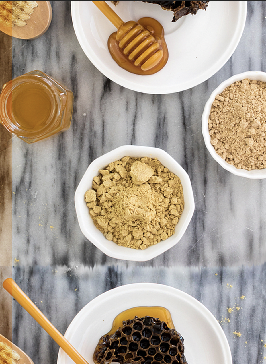
Here is the blank cover:
Let’s first look at the basic principles of a reci-bee cover, with a little help from the bees at Glad Works:
Balance
When things are visually balanced, potential buyers begin to feel uncomforable upon first glances, which is never a good thing, unless that’s the angle you’re going for (in this case, it’s not).
With the additions of bee’s to the page, it not only adds context to what the recipe book is about, but also uplifts our family-friendly tone.

Every added detail is focused on the left-hand side. When we add another bee to the right-hand side, it helps pull focus to the centre of the page, where the title and headings will be.

Not one’s to brag, but we did create and name the honey bees ourselves. There’s Bennie, Bernard and Truffles (that one was randomly chosen out of catelogue, and who are we to argue with fate).
Rhythm
Rhythm isn’t just for the waggle dance.
It can be for design as well, where you create a pattern through repeating and changing elements. That is one of the reasons why the placement of the bees is so important, they help create a relaxing and comforting feel.
Our logo is a key selling point and an essential ingredient to maintaining our successful brand, ergo it takes centre stage just like the Queen bee it is.

Emphasis
To make the important things stand out, like our amazing brand name Holden Honey Hives, we encorporateed it to share the centre stage with our logo. To have a little fun whilst designing, we decided to make use of the cover image, and, obviously taking a risk, surround the circle with our text. And guess what…it worked!
We are the bees knees of recipes!
We though we’d use this as our tagline, because it’s the truth and something we’re very proud about. Don’t let the haters bring you down, we haven’t and look at us now!
By using this, it illustrates that we bee-live in our recipe book and so, to show its prominence, we placed it in its own personal sphere (we tried a hexagon, but it just wouldn’t work as somethings are just not meant to be). If it were a print recipe book, we decided that it would have been a scented sticker, can you guess the scent?
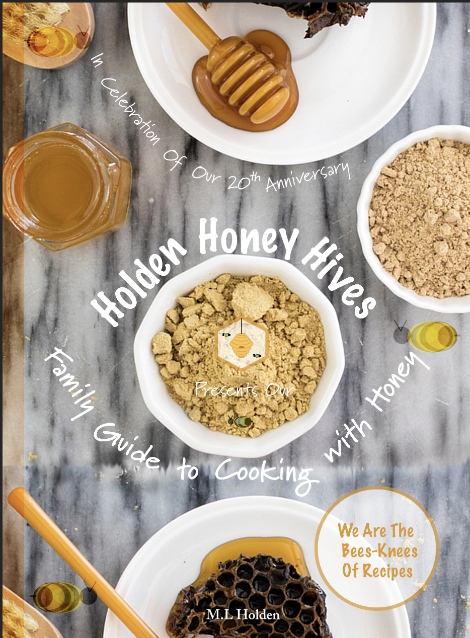
Unity
Alast, unity. This can be undertaken by repeating a certain colour scheme, texture, using similar type styles and so forth. Bee’s have a distinct colour pattern, so why shouldn’t we?
After extensive deliberation, we decided upon using light, honey-based tones with a modern twist to it.
For our brand name and tag line, we used the font style Marker Felt, for the headline In Celebration of Our 20th Anniversary and for Family Guide to Cooking with Honey, we used the font style Marydale. These had a fun, not so serious look that just worked for us.
To help tie the cover together, a warm honey-toned finish was applied. You can just feel the love and warmth radiating from inside, and it doesn’t get any better than that.
Well our little darling bees, we hope that looking into our creative process was as helpful to you as it was to us.
We look forward to catching up with you next week for: A Website: don’t get left behind!
Until then our ever-buzzing hive, good day and good night.